#Hatching and Cross Hatching shading techniques for drawing
Explore tagged Tumblr posts
Visit Tumblr Blog
Explore Tumblr blogs with no restrictions, modern design and the best experience.
Last Seen Tumblr Blogs


Fun Fact
Kazakhstan’s Minister of Communications and Informatics has blocked the Tumblr site because it contained 60 sites of terrorism, extremism, and pornography in 2015.
Text

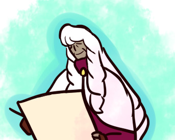
I had some help w/ the bg on this one, but I helped him with some hemming, so it's all fair. Anyway, this is silverleaf fungus. She infects host plants. You probably can't eat this, but I dunno. I'm not a scientist. :D
#art#drawing#sketch#any tips?#traditional art#cute#line art#funguary#fungus#funguary2024#shading#shading techniques#stippling#cross hatching#scribbles#psychadelic
9 notes
·
View notes
Text
More European Renaissance Art Vocabulary

for your next poem/story
Halo - The gold circle or disk placed behind the heads of Christ and saints, a symbol of their sanctity or the light of God.
Hatching - The drawing or engraving of fine parallel lines to show shading. When the lines intersect each other, it is called cross-hatching.
Horizon Line - The line where the sky and earth appear to meet. The horizon line is drawn across the picture at the artist’s eye level.
Hue - A particular variety of a color, shade, or tint.
Lunette - A semicircular shape.
Magus - A member of the ancient Persian priestly caste, skilled in Eastern magic and astrology. In the New Testament, the Magi are the three wise men who came from the East to pay homage to the newborn Christ Child.
Majolica - Tin-glazed earthenware.
Palazzo - An Italian word used to describe a large building. It may be a mansion or palace, or an official government building like a town hall, court, or embassy.
Passion, or The Passion of Christ - The events surrounding the Crucifixion of Christ; a popular subject for religious drama, painting, and sculpture.
Perspective - A technique that artists use to represent the three dimensional world on a two-dimensional surface, such as a piece of paper, canvas, or wood panel. Using perspective, an artist can create the illusion of depth or space and show the proper proportion between objects. Without perspective, a painting or drawing will appear flat.
Pictorial Space - The illusion of three-dimensional space created on a two-dimensional surface.
Predella - An Italian word for the series of small paintings that form the lower section of large altarpieces. It usually has narrative scenes from the lives of the saints who are represented on the main and side panels of the altarpiece.
Putto - From the Latin word meaning “male child.” In 15th- and 16th century poetry and painting, putti are depicted with wings and connected with the god of love, Eros, also known as Cupid.
Red - In Christian paintings, a symbol of the blood of Christ or the Passion.
Relief - A raised surface; for example, sculpture that is carved or modeled and which projects from a background.
Star - In Christian paintings, a symbol of divine guidance or favor. The Star of the East guided the three Magi to Bethlehem.
Triumph - An ancient Roman tradition honoring the return of a victorious general, who paraded his soldiers, prisoners, and spoils through the city streets.
Tromp L’oeil - French for “fool the eye”; a style of painting intended to trick the viewer into believing that the minutely observed objects shown are part of the viewer’s three-dimensional world.
Vanishing Point - The point where parallel lines appear to meet on the horizon line.
Source ⚜ More: Word Lists ⚜ Part 1
#renaissance#art#terminology#writing inspiration#writeblr#dark academia#writing reference#langblr#spilled ink#creative writing#light academia#literature#writers on tumblr#poets on tumblr#writing prompt#poetry#art reference#michelangelo#writing resources
224 notes
·
View notes
Text
I decided to compile a list of art prompts for my friends based on my past history of drawing and working with classes.
Feel free to use any ideas you like for yourself!
Have you drawn:
[Original Characters: OCs] [Canon is also fine] -oc crack -Date Start! (Any fanfic tag applicable) -oc family eating together or other any homely activity -ocs fighting -oc sharing their craft -ocs interacting with animal -oc trusting someone with a secret -ocs swimming (beach day/lake day/tubing/diving) -oc preening/with eachother -oc 'final boss' doing cool or evil stuff -ocs performing a feat of strength magic or agility -ocs hiking or traveling any landscape -oc sick day -Species swap/Outfit swap -ocs in clothes they would NEVER wear -If their outfit is inspired from a specific culture, depict with an outfit from a different one (The more details you research, the better) -The Flashback Episode | The Tragic Backstory -The Montage -ocs but child/adult -ocs but animal -ocs but furry/furry but oc -ocs but they're in the wrong genre -oc or your own dream -Young oc participating in an activity you once had and miss -Draw how your parents/extended family/guardian would perceive your oc -Draw how your oc perceives themself -ocs expressing with Animal Crossing emotions [X] -Your friends ocs/interacting with yours -ocs interacting with canon characters [Perhaps who inspired them?] -ocs in a style of your choosing -In silhouette
[Visualization] -Your inner/sleep paralysis demon personified -Your art block personified out of spite -The Hyperfixation -The game you last played -The media you last laughed or cried at -The last book, fic, podcast, or audio skit you liked drawn with characters -Draw a frame of your own music video of a song you've never seen one for -Depict your likes/dislikes -'Mary Sue' yourself -Caricature of what you hate about your art -Doodle what you like about other people's art that you want to learn -Chibify/Cartoonify your favorite foods -Give an inanimate object of your choice googly eyes -Draw yourself as a… -Combine two or three animals you like [Actual art advice I got from elementary]
[Analyzation]
Draw Any: -A Flower, Vine, Tree, Stump, Moss, Fern, Vegetable, Fruit, Mushroom, Rock, Shell, Cloud, Slime -A Cat, Dog, Bird, Bunny, Mouse, Horse, Deer, Goat, Giraffe, Cow, Yak, Elephant, Rhino, Lion, Tiger, Fox, Bat, Snake, Gecko, Monitor, Eel, Seal, Swordfish, Ray, Shrimp, Crab, Lobster, Shark, Sunfish, Manta, Flounder, Whale, Cephalopod, Frog, Butterfly/Moth, Beetle, Stickbug, Mantis, Bagworm, Millipede, Anteater, Coral, East style Dragon, West style Dragon, Hydra, Phoenix, Unicorn, Jackalope, Griffon, Manticore, Hippocampus [add 'myth' before searching], Kirin, Tanuki, Nekomata, Tengu, Kitsune -3 Different subspecies of any of these animals or plants -Depict them overweight or underweight -Turn them into an animal sidekick -Take a small piece of one of these and try to texture it -Shrink or Enlarge -Emphasize what you like most about the animal to a ridiculous degree. If you like whiskers, draw them extremely long. If you like tails, draw a super floppy tail. If the wings, draw them huge or add multiple. If you like a dragon's fire breath, draw Trogdor The Burninator -Depict how you think the previous prompt's animals would survive or struggle with these new traits
[Technique] -Shade with only dots -Shade with only hatched lines -Digitally shade with only 3 different colors -Color using one of the random pallets online [X] -Draw swirlies, rainbows, and zigzags with different colored crayons -If digital, Hue-slide [Hue and Saturation] an existing landscape or character and doodle them in the changed colors -Paint/Digitally on top of a real-life picture using it's own colors below -Draw or paint in a medium you are unfamiliar with -Mix paints until they match the colors in a reference (Basics|Sheet) -Draw in mspaint/crayon (badly or not is your choice) -Draw without lifting the pencil or erasing -Draw with your eyes closed -Draw with your nondominant hand -Draw basic 3d shapes -Draw 3d shapes connecting with one another -Draw basic 3d shapes aligned on a 1, 2, 3 point perspective -Draw an organism from memory, trace it 3-10 times, then try to draw it again -Draw any skeleton -Draw The Meatman (Muscular System) -Draw skelly muscled or visible version of hands, feet, elbows, legs -Noses, eyes, ears, lips, eyebrows -Booty, Genitals -The back -Draw Gestures with a time limit of your choosing [X] -Coat an entire sheet in charcoal, then erase a picture into it. For digital, use the eraser to draw a picture into a fill-tooled canvas -Draw a character without using a solid outline -Acquire a bunch of stickers or some stamps, then try to cover up an entire piece of paper or object in them with as little empty space left as possible without overlapping -Take a piece of paper and create as many differently drawn lines or shapes as you can manage. Make sure to fill the page with them.
Ummmm I guess feel free to tag me if you really liked drawing one of these?
#art help stuff#amateur stuff#prompts#Obviously more can be added however anyone sees fit for themselves or their friend group#I'm not really good at these but it's been a long while since I've seen one so I figured I should cover the basics#I would have liked to add more varied mythical animals but the internet does not easily come up with results for them <_<#Nimue#Sage#oc#I'm also obviously cartoonish-inclined so these may not help as much for draftsmanship and realism#Huh the colors messed up at points. Ah well
6 notes
·
View notes
Note
Hey, artist question here: as a great sketch artist, do you think you could give some advice to another sketch artist who likes drawing things as mostly monochrome pencil pictures and hardly ever colors them, but at the same time feels insecure about it because it feels like a sign of laziness?
...I'm speaking for a friend, of course.
Not sure if I'd say "great" but I'll see what I can do,
Firstly, don't be afraid about doing sketches or not coloring a piece and feeling "lazy", not all art has to be colored or finished. In fact the best thing about sketches is that they don't have to be finished, they're just sketches.
Second, I'm speaking from the traditional art side of it since I'm not well versed in the sketch-side of digital art. As such, I'd say it's about knowing the values of shading the subject is supposed to be. Knowing how dark or light something is supposed to be (James Gurney has a great book called, "Color and Light" which I recommend. Sure it's mostly about color, but it can also be applied to monochrome at points), and then knowing how to shade the subject. If we take some of the characters I regularly do, such as Anne and Marcy. Both of their hair is darker than Sasha's but Anne's is lighter and so I don't apply as much pressure when I shade her hair in vs when I shade in Marcy's black hair. Granted I tend to shade their hair in a more solid however the same principle can be applied to the various shading techniques used to fill out blank space (hatching, cross-hatching, etc etc). Studying shading techniques might be helpful in giving some depth or whatever to a sketch than if it was just black-and-white.
Third, Idk if you're using a basic graphite pencil or if you are using a color sketch pencil but play around with different pencils and see what works for you. Sometimes playing around can help figure out what you were missing. I do like using the normal graphite pencils but I don't like how easily and quickly they smudge (a lot of my early Weekly Leilana sketches are smudged all to hell in my sketchbook) and while the color sketch-pencils also smudge, at least it looks a bit better than the regular grey graphite.
Study other ppl's sketches, those that you like or find impressive or what to emulate and try and figure out how they did it. Have fun, get messy and be creative with sketching. Lineart and color is already stressful enough, let's not panic about sketching too much.
Not sure if this is useful but it was the first things I thought of as I'm thumbnailing some stuff atm
9 notes
·
View notes
Text
The Charm of Pencil Rendering: A Guide for Students Studying Multimedia
Pencil rendering is still an effective and expressive technique that links us to centuries of artistic history in an age where digital art and technology rule the art world. Learning pencil rendering as a multimedia student can help you become more creatively flexible and have a deeper understanding of artistic fundamentals. Precise control, depth, and texture are made possible by pencil rendering, which is timeless and essential to all artistic mediums. This tutorial will assist you in starting your adventure into the world of pencil art, regardless of your level of experience or desire to improve your abilities.

Understanding how to Render with Pencils
Pencil rendering is the process of producing artwork with depth, shading, and textures using colored pencils, graphite, or charcoal. Pencil rendering uses manual methods that call for patience and control, in contrast to digital art, which is created on a computer. The subtle tone changes, delicate lines, and the depth created by layering and shading are what make this art form captivating.
Key Tools to Begin
Sketchbook and Paper: Select high-quality paper with the appropriate texture (rough for improved graphite adherence, smooth for fine details). For a variety of shading effects, graphite pencils come in grades ranging from harsh (H) to soft (B). Charcoal Pencils: Perfect for expressive strokes and deep, rich blacks. Blending Tools: To even out shading, use cotton swabs, tissues, or stumps. Erasers: Precision erasers for fine details and kneaded erasers for delicate accents. For intricate work, use sharpeners and mechanical pencils ( optional for mechanical pencils ) to guarantee precise lines and constant sharpness.
Crucial Techniques to Learn
Sketching and Line Work: Learn to manipulate your lines by starting with basic forms. Shading and Blending: To add depth and texture, use master hatching, cross-hatching, stippling, and smooth shading. Light and Shadow: To produce realistic drawings, comprehend how light interacts with surfaces. Composition and Perspective: To create more dynamic artwork, learn about depth, symmetry, and balance. Texturing and Layering: To create representations that are richer and more realistic, gradually add layers.

Connecting Digital Art and Pencil Rendering
You can use your understanding of pencil rendering as a solid basis for digital design, animation, and other multimedia projects as a multimedia student. Hand-eye coordination is improved, contrast and form are better understood, and creativity that may be transferred to digital platforms is fostered by practicing conventional approaches. Consider taking a picture of your pencil work or scanning it, then utilizing programs like Photoshop or Illustrator to enhance it digitally.
Getting Inspired and Creating Your Own Style
Finding your own style is one of the most thrilling parts of pencil rendering. Begin by studying the pencil works of famous painters such as Albrecht Dürer, Leonardo da Vinci, and contemporary masters of graphite. Try a variety of shading methods and subjects to find what appeals to you. Still life drawings, architectural sketches, portraits, and nature can all be excellent sources of inspiration.
The secret to improvement is patience and practice.
Pencil rendering requires commitment and time to learn, just like any other ability. Make time for consistent practice sessions, push yourself with novel approaches, and don't be scared to make mistakes—they're a necessary part of learning. You can grow more quickly by participating in art communities, attending workshops, and asking for helpful criticism.

In conclusion A fun and engaging technique that lets you convey your ideas with accuracy and depth is pencil rendering. Incorporating pencil rendering to your workflow as a multimedia student can enhance your digital creations and expand your creative horizons. The process of using pencils to create art is just as rewarding as the finished product, whether you are sketching, shading, or experimenting with mixed media. Grab your pencils, enjoy the process, and unleash your inner artist!
2 notes
·
View notes
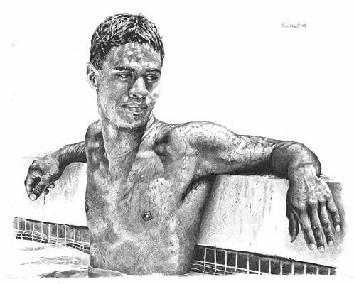
Text
Languishing on the sofa as I may be today, I still found something creative to keep me occupied. There’s only so many Leverage re-runs a fellow can watch without going stir-crazy so I picked up my shiny new Apple pencil and treated myself to learning how to draw A Karlach.

Drawing is not a skill I’ve ever really picked up but I’ve been tremendously motivated lately by the combined factors of getting deeper into embroidery design + a massive heartstopping crush on every single Baldur’s Gate character. My end goal here today was to try and figure out what combinations of lines and shading really make a face look like A Person instead of just a pointy ended oval, using techniques that will translate well to embroidery stitches. So I traced a screenshot to get the outline and then went to town with cross-hatching.

I ended up with something not terribly far off from a design I might be able to embroider. Love that beginner’s rush when you learn a new skill and you feel so proud because you aren’t yet good enough to detect all the flaws in what you just did, eh? ;)
10 notes
·
View notes
Note
Hi! This is not an ask, just an undercover hello.
You're making me famous out there in the Tumblr world😁! I feel I need to post a work in progress sketch tomorrow, just pencil work with support lines and stuff still there. Is there a way I can post it to you, without anybody else seeing it? So you can tell me if it's "postable". It's just a small sketchbook page with 2 early stage sketches of Charlie's face from a little different angles. But I think I can see they are going to be good. I bought three new black ink pens today one 0,8 mm for line work, one 0,5 mm for face details and stuff like that and a 0,2 mm I figure could be good for shading with cross hatching and similar techniques I don't know the name for in english. I found my charcoal pencils so I bought an eraser pen for highlights. I also got myself a 32 box of good colour pencils. They are a little bleak but that will make blending easier. So I stocked up a little so I should be able to do a decent drawing now. We'll see if I got something to show you tomorrow or on wednesday.
Speak to you later!
yeah! you can just send me the image in our dms! I look forward to seeing it!!
2 notes
·
View notes
Text
Skeleton Roses

I created this piece back in 2023 where I used a black, red and green biro to draw up the details and tonal shading. I used different techniques to create the shades by cross hatching, line work and circular shading.
1 note
·
View note
Text
what is pencil drawing(Potrait)
A pencil portrait drawing, often referred to as a pencil portrait, is a highly detailed and realistic representation of a person's face or occasionally their upper body, created using graphite or charcoal pencils on paper. This type of drawing aims to capture not only the physical likeness of the subject but also their personality, emotions, and unique characteristics. Here's a more detailed description of pencil portrait drawing:
Medium: Pencil portraits are typically executed using various grades of graphite pencils, ranging from hard (H) to soft (B), charcoal pencils, or a combination of both. The choice of pencils depends on the artist's preferences and the desired level of detail and shading.
Techniques: Pencil portrait artists employ a wide range of techniques to achieve lifelike results. These techniques include hatching and cross-hatching for shading, blending with tortillons or stumps to create smooth transitions, erasing selectively to create highlights, and meticulous attention to detail in rendering facial features.
Realism: The hallmark of a good pencil portrait is its realism. The artist strives to capture not only the subject's physical appearance but also the subtle details, such as the play of light and shadow, texture of the skin, and intricate facial features.
Photographic Reference: Many pencil portrait artists work from photographic references. These photographs serve as the basis for the drawing, allowing the artist to capture the subject's likeness accurately.
Emotion and Expression: Beyond mere replication of facial features, pencil portrait artists aim to convey the subject's emotions, personality, and character through their work. Achieving a sense of life and expression is a crucial aspect of successful portrait drawing.
Scales and Sizes: Pencil portraits can vary in scale and size, from small, intimate sketches to larger, more detailed renderings. The choice of size often depends on the artist's preferences and the intended impact of the artwork.
Customization: Pencil portraits are often commissioned works, created for individuals who want to commemorate loved ones or capture a specific moment in time. The artist works closely with the client to ensure the drawing meets their expectations and captures the essence of the subject.
Styles: While pencil portraits are typically characterized by their realism, artists can also employ various stylistic approaches, including hyperrealism, impressionism, or more expressive and abstract styles, depending on their artistic vision and the preferences of the client.
Challenges and Skill: Creating a pencil portrait requires a high level of skill and patience. Achieving precise likeness, capturing subtleties of expression, and rendering fine details demand a meticulous approach to drawing.
3 notes
·
View notes
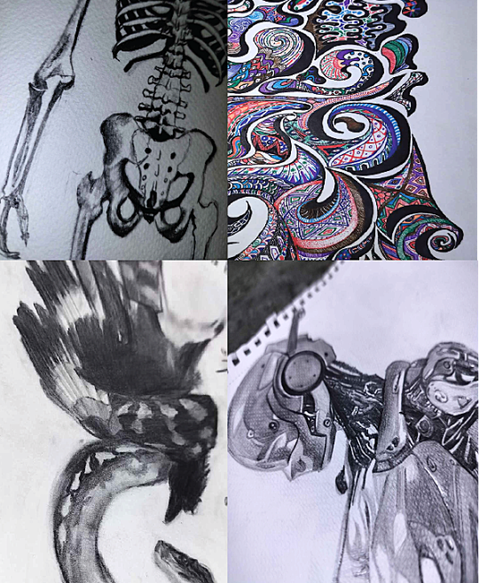
Text
Using the skritchy and fast technique, we come out with this, although skritchy, their lines are always connected in the end, I assume that's so colouring is easier

This is in traditional.

And this is digital, please don't mind the obvious quality difference.
Now, thirdly, We've got anatomy, in the face,the eyes are angled rectangles, the nose is simply a line, with a little shading to make it more fufilled so the brain fills in the details by itself (? The nose is just an impression basically). The mouth depends on the expression but a semi constant is a little line to make the impression of the lower lip. The ears reminds me of hanako-kun just with thinner lines. I think the chest looks like a pentagon, 3d pentagon lessgoo. Extremities are just straight line/rectangles that get details later. Hand are just, nice, but all I can do is claws.
Hair, is skritchy lines, but long, and have baby long lines in them.
Eyes sometimes get definition by erasing an outline around them in colourless pieces.
Here is an example of how I tried to copy it.

Fourthly, we've got shading, I'm going to talk about the colourless type, there's two types here, block shading and cross hatch, I personally like crosshatching so that is what I'm going to focus on, first, before the hatching begins, sometimes theres a line that goes along the thing getting shaded, I believe that is so it looks neater and cleaner, and it is, I found myself having fun doing that same.
...
And at last, since I believe that that drawing was too small, here is a drawing of what I liked about @dadofdisappointment 's and what I know in a (hopefully) cohesive portrait of my persona.

And a digital portrait of a random character because I really wanted to do that solid colour background too

Man, I really liked doing this, this was so fun.
#part two#its here#man i like how my art turned out with this art style#im so drawing like this from now on!!!#✨✨✨
2 notes
·
View notes
Text
Skills i use when drawing Charcoal Portraits
Gathering reference materials: Collecting high-quality photographs or live models to use as references for the portrait.
Preparing the workspace: Setting up a well-lit and comfortable area with a drawing board or easel, charcoal pencils, erasers, and paper.
Sketching the basic outline: Starting with light strokes to establish the proportions, contours, and major features of the subject's face.
Building form and shading: Gradually adding layers of charcoal to create depth, volume, and three-dimensional form, paying attention to light and shadow.
Blending and smudging: Using fingers, blending stumps, or other tools to soften and merge the charcoal strokes for a smoother appearance.
Detailing and refining: Adding finer lines, textures, and intricate details such as facial features, hair, and clothing to capture the subject's likeness.
Controlling values and contrast: Adjusting the intensity of dark and light areas to create a balanced composition and enhance the overall impact of the portrait.
Working with highlights: Strategically preserving areas of white or lightly shaded paper to represent highlights and add luminosity to the drawing.
Using different techniques: Experimenting with hatching, cross-hatching, stippling, and other mark-making methods to achieve desired textures and effects.


2 notes
·
View notes
Text
All very good points!
Also, while AI and digital tools are pretty darn good at imitating traditional media, there should be more interaction of the brush with the canvas, at least until the 20th century when artists start using all kinds of media.
Online reproductions of traditional paintings aren't always detailed, and some painters smooth out their strokes and edges or pile on enough paint to hide the weave of the canvas, but I still feel like digital tools attempting to recreate oil painting are too uniform, missing subtle irregularities of line and hue since one keeps having to mix more colors unless you buy a gazillion different tubes.
Look at my boy Cézanne, varying stroke thickness, paint opacity, obviousness of his brushwork, leaving irregular little flecks. He wasn't focused on drawing, but color — he realized that a dress could look yellow and blue to our eyes, so he used warm and cool modulations of the same color, a technique most painters after him adopted more or less.


The AI generated image tries to mimic some of these methods, like the varying thickness of brush strokes, but it's random. Why do some edges get dark outlines but others not? Why are most of the highlights the same brush size? Why is the painting blank between the central man's legs? Why is there so little shading or color variation to suggest the 3 dimensional forms of the body?
Some more examples of real paintings from the Art Authority app vs AI...
Renoir, "Charles and Georges Durand-Ruel," 1882. Renoir picked up Cézanne's warm and cool colorplay, turned up the lights and added lots of quick feathery brushstrokes, so you get all these flecks of color. Cigarettes and pipes are also really common before the 1970s.

Okay, not everybody uses texture and highly visible brushstrokes. Even so, hue variations are nearly impossible to avoid when mixing pigments manually, and any decent painter will indicate certain highlights and edges/details with single brushtrokes to capture a shape. Note close strokes almost like crosshatching along edges of some shadows to keep them from being too sharp (the back of the older man's outstretched hand and part of his sleeve, eg)
Caillebotte, "The Floor,Scrapers."

Jumping ahead, way past the impressionists, below is a 20th century oil painter softening edges to hide brushwork, opting for a formal, almost photographic style with no background, and favoring realism instead of impressionism.
At first glance, it's hard to find the human touch in the style of painting, apart from the fact that the woman's personality comes through in a way that AI just can't pull off. But again, you've got those subtle warm and cold variations in the background, a finely-observed use of dusty rust, crimson and dark burgundy to capture the texture of velvet, and careful modeling of shadows and brighter areas to suggest the forms of her body coming towards you.

Paxton, portrait of Mrs Charles Tappan, 1935.
Notice her skin tones are a rich medley of greens and yellows and pinks that the AI generators can't model as skillfully because they don't understand the landscape of the individual's features or the way skin shows a hint of what's underneath. Also, when you look closely, there are distinct brushstrokes to indicate her crimped hair, to pick out highlights on jewelry and chair, and to define a few edges.
And how about Leyendecker, since there's a lot of AI-generated imitations?


I had to look up and make sure he was really using oil paint. Yes, but he mixes it with thinner and stand oil so it flows like watercolor/ink. And he's a master of the art deco/sign painter's craft of precise, clean lines and curves. His bold, angular brushstrokes are amazingly regular and parallel; and he loves cross hatching. (I bet he did phenomenal ink drawings.) But if you start squinting at the pinstripes — see the gent at far right — you'll see how he interrupts them, changes their color, alters their direction to follow folds and form with precise imprecision, if that makes any sense.
The AI versions of Leyendecker jump out like a sore thumb.

Where did those curves from come from? Where's the contour line pinstripes? The jaunty single line to indicate eyelashes? Where's the arrow collar? Where's his boyfriend's round button chin? Why are the wrinkles of his shirt continued into his suspenders?
Note: I should be careful, since digital artists don't mix traditional pigments to select their colors or have physical hair brushes, so some of the things I mentioned above (subtle color variations, irregular brushstrokes) may not show up. They are still painting, they're just using different tools to do it. So the OP's method of checking to see if the painter was born yesterday, so to speak, is probably safer than playing art critic.
But I think it's worth taking a closer look and searching for the human hand behind the art: the irregularities, the deliberate choices, the understanding of reality that AI doesn't have. If nothing else, it'll reward you with a greater appreciation for someone's work, and you'll probably spot things you missed! And the imperfections... the signs of our common humanity... are part of the fun.
this is your periodic reminder that for all the artifacts and errors and "tells" one could possibly list, the only reliable way to actually determine if an image is ai generated is to investigate the source. it is becoming increasingly common for "fake classical paintings" to circulate around curative aesthetic blogs, and everyone should be using this as an opportunity to not only exercise their investigative skills but also appreciate art more in general. you're all checking out the artists you reblog, right? 🫣
so what are some signs to look for? let's use this very good example.
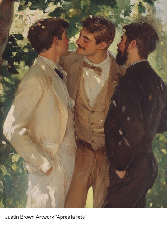
what a lovely late-impressionist piece blended with evocative leyendecker-esque themes! why haven't you ever heard of this artist before? surely tumblr would be all over an artist like this. who is justin brown?
your two options from here are to do a search for the name, or a reverse image search. i prefer reverse image searching, particularly when it comes to a common name like "justin brown". so what does that net?
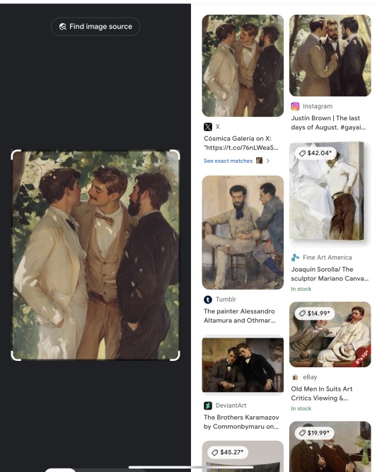
Immediately, without looking at any text, something is wrong: it barely exists. an actual historical piece would turn up numerous results from websites individually discussing the piece, but no such discussions are taking place. Looking at the text, though, does show the source-- and at least in this case, the creator was honest about their medium.
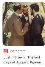
But let's also look at the "exact matches", in case a source doesn't make itself apparent in the initial sidebar results like this.
This section will often tell you post dates of images, and here it can be seen that the very first iteration of the image was posted 15 days ago. It did not exist online prior to that.
Seeing how long an unsourced image has been floating around is a skill applicable to more than just generative images! See a cool image of an artifact or other intriguing item with a vivid caption? Reverse search it! If all the results are paired with that caption and only go back a few months, you might just have viral facebook spam.
Sometimes generative creators are dishonest about their medium and do not tag it like in the example, so that's when establishing "jpeg provenance" becomes important. While it can be a little trickier to determine if someone is using generative images and not admitting to it if they aren't trying to pass it off as a classic, something to consider is the age of their account and the frequency with which they post. Here are some account red flags:
-Did they only start posting art after 2022, or if they did before, did their style/skill level WILDLY change? Not gradual improvement-- I'm talking amateur graphite portraits straight into complex digital renders. Everyone starts somewhere, newness is not a red flag alone; it's newness combined with existing in a vacuum away from any community.
-Do they post fully-finished paintings several times a week? -Do many of these paintings seem iterative of a similar theme or subject matter ("three well-dressed young men face each other under shade and dappled sunlight")?
-Does their style change in inconsistent ways? An artist that can swap between painting like Drew Struzan and Hokusai should be pretty well known, right? Why is no one hyping this guy?!
-Do they have social media besides the source instagram? If so, what are they posting about? Are there any WIPs? Doodles? Interactions with other artists? Gallery dates? 3am self-doubt posts? Or is it all self-promo? Crypto? Seemingly nothing art-related at all for someone pushing out 3 weekly paintings?
Basically, if it's important to you to omit this stuff when you curate, please don't just smash reblog if the source doesn't seem to be the OP themselves. Seeking out sources was important even before this became an issue, now it is more than ever.
peace n love
29K notes
·
View notes
Text
Best Sketch Pen Techniques for Drawing and Illustration

In the ever-expanding world of art tools, sketch pens have carved out a special place for artists, illustrators, and hobbyists alike. From quick doodles to detailed portraits, sketch pens offer versatility, vibrancy, and control that other mediums often struggle to match. But getting the most out of sketch pens requires more than just picking up a pen and drawing—it’s about knowing the right techniques, materials, and methods to elevate your work.
Whether you’re a beginner exploring your artistic side or a seasoned illustrator looking to refine your approach, this comprehensive guide to the best sketch pen techniques for drawing and illustration will help you unlock the full creative potential of this underrated tool.
What Makes Sketch Pens Unique?
Before diving into techniques, it’s important to understand why sketch pens are popular in the art and illustration community:
Vivid, consistent color output
No mess compared to paints or inks
Variety of tip styles: fine, brush, chisel, and bullet
Quick-drying and smudge-resistant (especially alcohol-based)
Portable and easy to store
Because of these features, sketch pens are widely used for:
Fashion illustration
Comic book inking
Calligraphy
Architecture sketching
Art journaling and more
1. Line Weight Variation (Pressure Control)
A fundamental technique in sketch pen drawing is varying the line weight to add depth, emphasis, and movement to your artwork. This is especially important in character design, botanical illustrations, and concept sketches.
How to Practice:
Use more pressure for bold, dark lines.
Apply less pressure for lighter, more delicate strokes.
Combine thick and thin lines for a dynamic look.
Best Pens for This: Brush tip sketch pens or dual-tip markers are ideal as they allow expressive variation in stroke width.
2. Hatching and Cross-Hatching
Hatching (parallel lines) and cross-hatching (overlapping perpendicular lines) are classic inking techniques that work beautifully with sketch pens. They help in:
Creating shadows
Adding texture
Implying volume
Tips for Effective Hatching:
Use fine-tipped pens for better control.
Keep your line spacing consistent.
Cross-hatch at different angles for smoother shading.
SEO Tip: Artists searching for "sketch pen shading techniques" often look for this method, so it’s essential to master it.
3. Stippling (Dotting)
Stippling is the process of placing numerous small dots to create shading and gradients. While time-consuming, it gives a highly detailed, textured effect ideal for realistic illustration styles.
How to Use Stippling:
Use tiny dots closely packed for dark areas.
Space them further apart for lighter zones.
Maintain consistent hand motion to avoid smudging.
Best For: Botanical drawings, portraits, and surreal art.
4. Layering and Color Blending
Unlike paint, sketch pens—especially alcohol-based ones—allow for layering of color to create gradient effects and subtle transitions. While blending can be tricky, it's one of the most powerful tools in pen illustration.
Techniques:
Light-to-dark layering: Start with a base light color and layer darker shades on top.
Colorless blender pens can help in softening transitions.
For water-based pens, try wet-on-wet blending by quickly overlapping strokes.
5. Dry Brush Technique (For Brush Pens)
With brush-tipped sketch pens, you can mimic the appearance of a dry brush from traditional painting. This gives a rough, textured look ideal for adding interest and grit to an illustration.
How to Achieve It:
Use a nearly dry or aging brush pen.
Lightly drag the tip across textured paper.
Experiment with fast, sweeping strokes.
This is a favorite among artists who create expressive sketches or comic illustrations.
6. Outlining and Inking
Outlining is one of the most common applications of sketch pens, especially in cartooning, manga, and comic book art.
Outline Like a Pro:
Start with a pencil sketch.
Choose fine liners (0.1–0.5 mm) for details.
Use bolder tips (0.7 mm or brush) for emphasis.
Erase pencil only after the ink is completely dry.
7. Creating Gradients
Gradients are smooth transitions between two or more colors. They can be used in backgrounds, fashion illustrations, or product concept sketches.
Gradient Techniques:
Overlapping strokes: Layer light over dark or vice versa.
Use parallel strokes in the same direction for smoothness.
Feathering: Draw quick, short strokes from both ends and blend in the center.
Paper matters—smooth bristol board or marker paper helps with even blending.
8. Masking and Negative Space
To keep certain areas white or preserve intricate details, try masking techniques using:
Masking tape
Stencils
Masking fluid (on thick papers)
This allows you to work freely around these areas and then remove the mask for a clean, sharp effect. It’s especially useful in architectural rendering or poster design.
9. Highlighting with White Ink or Gel Pens
Once your drawing is complete, you can add highlights to create a sense of light, reflection, or shine—particularly useful for eyes, metal surfaces, or water droplets.
How:
Use a white gel pen or paint marker.
Add after all layers are fully dry.
Place highlights opposite to your shadow areas.
This small detail can bring a flat sketch to life.
10. Mixing Media
Sketch pens can be beautifully combined with:
Colored pencils (for texture)
Ink liners (for definition)
Watercolors (for background washes)
Acrylic paint markers (for accents)
This mixed-media approach is common in fashion design, packaging art, and concept illustration.
Best Paper for Sketch Pen Techniques
The paper you use can make or break your sketching experience.
Smooth Bristol Board: Best for clean lines and blending.
Marker Paper: Prevents bleed-through, ideal for alcohol-based pens.
Watercolor Paper: For mixed-media work and brush-pen textures.
Sketchbooks with Heavy GSM: Suitable for layering and inking.
Avoid thin, porous paper that causes feathering or bleeding.
Common Mistakes to Avoid
Using poor-quality pens: They dry out fast and affect line consistency.
Not testing colors beforehand: Always test on scrap paper.
Skipping the pencil sketch phase: Planning your composition helps reduce errors.
Over-blending: This can damage the paper and muddy the colors.
Inadequate drying time: Ink smudges can ruin your piece.
Mastering sketch pen techniques opens up a world of artistic possibilities, from simple doodles to professional-grade illustrations. With the right pens, paper, and techniques—such as hatching, stippling, blending, and mixed media—you can transform your artwork and bring vivid life to your ideas.
Sketch pens are more than just tools—they’re a gateway to expressive, bold, and detailed illustrations. Whether you're sketching portraits, drawing landscapes, or designing graphics, these techniques will elevate your craft and help you create art that stands out.
0 notes
Text
Learn Offline Mehndi Course in Mumbai
Offline practice of mehndi (henna) may offer far more practical, manual benefits than what online tutorials frequently cannot offer. The following are the best tricks one can find from an offline mehndi lesson on how to know methods, patterns, and techniques for enhancing your proficiency:
1. Henna Cone Grip and Mastering Control
One of the initial skills you will receive in an offline session is learning how to grip and handle the henna cone properly. A professional mehndi artist can hold and maneuver the cone freely, and much of this is attributed to the way he holds it. Mehndi Course will enable you to receive immediate feedback on your cone hold, and this can be invaluable help in achieving better control. You will learn to hold the cone like a pencil, tight in your hand, so that you can execute very thin, delicate lines for intricate patterns.
2. Creating Symmetrical Patterns
Symmetry is also very important in mehndi designs, particularly when designing both hands or legs. Offline classes allow you to learn to design symmetrical designs physically. Tracing paper is one of the tools teachers use to show you how to design the same pattern on either side of the body. It's an important skill to design seamless, pro designs, and learning it from a teacher is a good way to pick it up fast.
3. Creating Delicate Details
Offline classes for mehndi from Arun Mehndi classes in Swastik House, 1st Floor Swami Vivekananda Road Mumbai, Maharashtra 400067 are best to learn how to create fine details in your designs. You'll be guided on how to draw fine lines, dots, and detailed designs such as paisleys, flowers, and vines. Fine details have the ability to transform a simple design into something special. You can learn how to excel in these fine details from an instructor through practice and critique, and learning how to do them perfectly.
4. Employing Varied Shading Techniques
Shading is a clever method that adds motion and depth to mehndi designs. At an offline session, you will learn various methods of shading, like cross-hatching or dotting, that produce different levels of intensities of color. A trainer can instruct you on various techniques and guide you through layering henna to create depth. This method comes very handy when you are creating large motifs like mandalas or flowers.
5. Designing Fluid Designs
Maybe the most important thing about mehndi is to learn how to make your patterns look as if they are flowing. Offline classes allow the teacher to show you how to arrange elements so that your patterns are not disrupted or stiff. You will be taught how to take advantage of the natural arm, hand, or foot curvature to make patterns look more organic and pleasing to the eye.
6. Consistency and Quality of Henna Paste
Another important element of effective mehndi application is the consistency of henna paste. An offline lesson will teach you how to prepare or make henna which is not too thick or too thin. You will also be taught how to keep the paste fresh and how to store it. This is particularly useful to make a dark, rich stain, which is characteristic of good mehndi art.
7. Learning Traditional and Contemporary Styles
Both traditional and contemporary styles can be learned in offline classes from teachers. You would likely learn traditional mehndi designs such as Arabic, Indian, or Moroccan mehndi. You may also learn newer styles such as geometric or minimalist mehndi. Having multiple styles at your disposal makes you versatile so that you can cater to any taste.
8. Getting Personalized Feedback
Lastly, perhaps the best benefit of an offline session is instant feedback from a teacher. If you are doing it incorrectly, the instructor can immediately correct you and prevent you from forming bad habits. This individualized guidance speeds up your learning and motivates you to feel more confident in creating mehndi art.
By attending an offline mehndi class, you're not only learning tricks and tips but also enhancing your creativity. This practical practice provides you with the hands-on experience and skills required to learn mehndi, either for personal or professional use.
URL: https://arunmehndiclasses.com/course-category/offline-mehndi-course

0 notes
Text
FIGURE DRAWING (FD1 - Tues/Thurs)
Working with ink - 03/20/25
I have added a video below that can be used for today's class.
Use the entire class time (2.5 hrs) to work a long pose using the cross hatching technique to emphasize value on the form.
Remember to note a horizon line to show where the figure stands and to note the direction of light on the form.
This means that in this long pose you will address the environment (wall and floor ) where that figures stands or sits etc.
Using the cross hatching technique, choose one pose to show value differences in the figure.
You need to show how light falls on the figure using this technique.
You are creating tonal and shading effects with this technique.
As you work, start light and work towards creating the darker values.
Remember that you cannot erase when working with ink .
You are trying to render a recognizable form through value.
Try to be as accurate as possible. Remember the body haves geometrical components. You should have options for the variety of strokes to render the accuracy of the figure.
Assignment is simply rendering one figure using a pen and nib technique. You can use the video below to search for the pose you would like to work with:
youtube
The following individuals will not be working on this assignment:
1) If you attended the student show on Monday.
2) If you have perfect attendance ( you have never been absent to class.
We will review the assignment in person on April 1st in class.
0 notes
Text
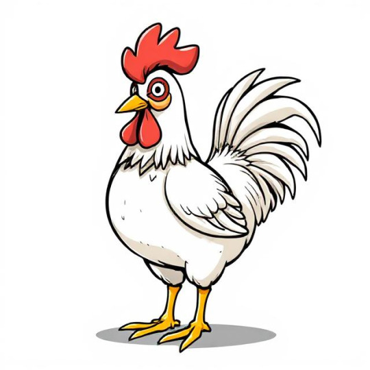
Chicken Drawing in Different Art Styles: A Creative Approach
Chicken drawing in different art styles can range from realistic to abstract, each showcasing unique characteristics. A realistic chicken drawing captures fine details like feathers and textures, while a cartoon chicken drawing features exaggerated expressions and bold outlines. A watercolor chicken drawing blends soft, flowing colors for a vibrant effect. Minimalist chicken drawings use simple lines to create elegant forms, whereas cubist chicken art breaks the bird into geometric shapes. Fantasy chicken illustrations might include glowing eyes or mythical elements. Whether sketching in ink, digital, or traditional media, each chicken drawing style offers a fresh creative perspective.
Chicken Drawing in Different Art Styles
Creating a chicken drawing in different art styles is a fantastic way to explore creativity and understand the nuances of various artistic techniques. Below is a detailed description of how you can approach drawing a chicken in several distinct art styles:
1. Realism
Objective: Capture the chicken as accurately as possible, focusing on lifelike details.
Technique:
Start with a detailed sketch, paying attention to proportions, feather texture, and anatomical accuracy.
Use shading techniques like hatching, cross-hatching, or blending to create depth and texture.
Highlight details such as the comb, wattle, and individual feathers.
Use reference images to ensure realism in the eyes, beak, and feet.
Materials: Graphite pencils, charcoal, or fine liners for precision.
2. Cartoon Style
Objective: Simplify the chicken into a fun, exaggerated, and expressive character.
Technique:
Use bold, clean lines and simple shapes to outline the chicken.
Exaggerate features like the comb, beak, and feet for a playful look.
Add vibrant colors and minimal shading to keep it lively.
Incorporate expressive eyes and a dynamic pose to give the chicken personality.
Materials: Markers, colored pencils, or digital tools like Procreate.
3. Abstract Art
Objective: Represent the chicken through shapes, colors, and forms rather than realistic details.
Technique:
Break down the chicken into geometric shapes or fluid lines.
Use bold, contrasting colors to evoke emotions or ideas.
Focus on the essence of the chicken rather than its literal form.
Experiment with textures, patterns, and unconventional compositions.
Materials: Acrylic paints, oil pastels, or mixed media.
4. Impressionism
Objective: Capture the chicken’s essence and movement with loose brushstrokes and light effects.
Technique:
Use quick, visible brushstrokes to suggest the chicken’s form and feathers.
Focus on the play of light and shadow rather than intricate details.
Blend colors directly on the canvas to create a vibrant, dynamic effect.
Keep the background soft and atmospheric to emphasize the chicken.
Materials: Oil or acrylic paints on canvas.
5. Minimalism
Objective: Reduce the chicken to its most basic elements while retaining its identity.
Technique:
Use simple lines and shapes to outline the chicken.
Limit the color palette to one or two colors.
Focus on negative space and balance in the composition.
Remove unnecessary details, leaving only the essential features.
Materials: Ink, fine liners, or digital tools.
6. Surrealism
Objective: Create a dreamlike or fantastical interpretation of the chicken.
Technique:
Combine the chicken with unexpected elements, such as mechanical parts or floating objects.
Use distorted proportions or impossible perspectives.
Incorporate symbolic imagery to convey deeper meanings.
Experiment with unusual color schemes and textures.
Materials: Digital art software, oil paints, or mixed media.
7. Pop Art
Objective: Make the chicken bold, colorful, and visually striking.
Technique:
Use bright, saturated colors and high-contrast patterns.
Incorporate repetitive elements or halftone dots for a comic-book effect.
Add bold outlines and graphic shapes to emphasize the chicken’s form.
Experiment with text or speech bubbles for a playful touch.
Materials: Acrylic paints, markers, or digital tools.

8. Cubism
Objective: Depict the chicken from multiple perspectives simultaneously.
Technique:
Break the chicken into geometric shapes and fragmented forms.
Show different angles of the chicken (e.g., side view, front view) in one composition.
Use a muted or monochromatic color palette to emphasize form over color.
Overlap shapes and lines to create a sense of depth and complexity.
Materials: Oil paints, pastels, or digital tools.
9. Traditional Japanese Art (Ukiyo-e)
Objective: Create a stylized, elegant representation of the chicken inspired by Japanese woodblock prints.
Technique:
Use flowing, organic lines to outline the chicken.
Incorporate patterns and textures inspired by nature, such as waves or flowers.
Use a limited color palette with soft, natural tones.
Focus on balance and harmony in the composition.
Materials: Ink, watercolors, or digital brushes mimicking traditional styles.

10. Graffiti/Street Art
Objective: Make the chicken bold, edgy, and urban.
Technique:
Use thick, dynamic outlines and vibrant spray-paint effects.
Add graffiti-style lettering or tags to the background.
Incorporate urban elements like brick walls or splatter effects.
Experiment with exaggerated proportions and stylized features.
Materials: Spray paint, markers, or digital tools.
11. Fantasy Art
Objective: Transform the chicken into a mythical or magical creature.
Technique:
Add fantastical elements like glowing feathers, horns, or wings.
Use dramatic lighting and vibrant colors to create a sense of wonder.
Place the chicken in an otherworldly setting, such as a magical forest or floating island.
Incorporate intricate details and textures to enhance the fantasy theme.
Materials: Digital art software, acrylic paints, or colored pencils.
12. Pointillism
Objective: Create the chicken using tiny dots of color that blend together when viewed from a distance.
Technique:
Use small, precise dots to build up the chicken’s form and texture.
Layer different colors to create depth and shading.
Focus on patience and precision to achieve a cohesive image.
Materials: Fine-tip markers, paint, or digital tools.
By experimenting with these styles, you can develop a deeper understanding of artistic techniques and discover new ways to express your creativity. Each style offers a unique perspective, allowing you to reinterpret the humble chicken in countless imaginative ways!
0 notes